Top 10 Features of a Good and Memorable Business Logo
Published on February 7, 2022
Did you know that a good business logo can help you connect with your audience?
Your logo is what your customers and target audience will identify you by. Therefore, when designing your logo, you should ensure that it represents your brand perfectly and can allow your customers to easily identify your business.
Several aspects go into creating a logo. These elements are often determined by the industry and type of business. But, first and foremost, the logo should uniquely capture who you are as a business, the feel of your brand, and the purpose of your business.
Our skilled graphic design team at Ideal Directories can help design a logo that is as special as your business. Or, if you are interested in hiring a freelance graphic designer, try searching on job sites such as Fiverr, Upwork, and Etsy. Whichever you decide, make sure to leave this type of important work to the professionals.
During the design process, keep in mind these key factors to ensure your business logo is memorable.
1. Color is Key
Color is a key feature in a logo. The color you choose will define how your brand presents itself. Like shapes, every color has its unique emotional meanings. These meanings are mostly universal.
For example, red, which is the color of blood and fire, evokes a feeling of alertness, passion, and urgency, while yellow, the color of the sun, is associated with warmth. Additionally, colors also have a cultural association. For example, green is the color of money in the United States and while purple is associated with royalty, it often represents evil in Japan.
Therefore, consider your location and target audience when choosing your brand colors. Since great branding requires a constant color scheme, make the colors of your logo the same as your employee uniforms, office decor, website, and more. Basically anything with your business name on it should be in coordination with the colors of your brand and logo.
When designing your logo, consider using various shades of a similar color to create a subtle contrast. This way, you will achieve a serene and eye-catching look. Additionally, you want to impress your customers with the right pop of color.
Think about colors that are commonly associated with your town or city. Try incorporating those into your logo design to come off authentic and local. If your directory website is focused more on offering money-saving coupons, you might consider incorporating the color green. A pop of color in your logo will prevent it from looking and feeling flat and will help it stand out from other business directories.
2. A Picture Paints a Thousand Words
A business logo design is a visual representation of the brand. With the use of a few simple icons, you can show your customers what you do and who you are. Get an icon that represents what you are selling.
For example, a holiday resort can use a sun and plane icon to get its target audience excited about a summer holiday. On the other hand, an ice cream company can use snowflakes to market their frozen treats.
If you're running a local business directory for your community, you might consider incorporating an image that is representative of your town or city. Adding an illustration or icon of a famous landmark could help communicate to site visitors that your website is specific to the area.
The goal is to ensure that you paint a memorable picture that also identifies with your brand or business.
3. Shape and Proportions
Shapes can make your logo stand out. Since graphic design is all about visual communication, the shape of your logo should push your design to the next level. Every shape represents a different character. For example:
Feel free to create an original abstract shape to convey a unique message and use shapes with exciting textures or gradients to remain memorable.
4. Keep the Design Clean with an Empty Space
While using shapes, pictures, and colors are crucial, one of the most important aspects to consider in the design process is that it's legible and can be read from a distance. A minimalist logo design is a hot trend in the business world.
A minimal or a "less is more" design makes the logo simple, bold, and clean. This design is easy to process, understand, and remember. Using blank spaces in your logo design is also helpful when designing apparel such as t-shirts and posters or brochures.
An empty space will make the logo easier to integrate into different formats and designs.
5. Tone that is Representative of the Industry
Though the logo should be literal, it should also fit your business. Businesses such as non-profit organizations demand a certain level of seriousness, while toy manufacturing companies can have a more playful approach to their design and messaging.
When designing the logo, keep in mind that you want to build trust in your audience that you are a credible company. Depending on the nature of your business, use serif tones and muted colors to stop it from feeling too much like a cartoon.
For example, toy companies and cereal manufacturers can use mascots and cartoon characters on their logo. On the other hand, a law firm cannot use the same characters on its logo. If you are looking to achieve a more humorous approach, your font and icons can convey that.
While an endorsement from a famous cartoon character cannot market a law firm, it can drive up sales for a cereal company. To optimize your logo, identify your target audience and have a brand strategy.
If your directory website is primarily focused on professionals, you might go with a design that is more conservative. On the other hand, if your directory appeals to local consumers searching for coupons and deals, a more casual, friendly tone might be more appropriate. Your logo should send a clear message as to who you want to identify with and appeal to.
6. Appropriate Business Cues
Your logo should communicate the general need-to-know information about your brand. It exemplifies everything that would be outlined on an informational page or marketing materials about what the brand is, product description, and written in press releases.
The design cues that relate to your brand will convey information about your business quickly. Use cues that your customers and target market can understand.
For example, a tooth image is the right cue for a dentist, dumbbells is a good cue for a gym, and a gavel is representative of a law firm or court. If you decide to use a graphic business cue in your logo, be sure to keep it relevant.
What kind of cues can you apply to your business directory logo? Map pins, money signs, price tags, shopping bags and magnifying glasses all relate to a site that helps people search for local businesses and coupons.
7. Different Sizes
Having several versions of a logo is one of the rising trends in logo design. Also known as responsive logos, these logos can shape-shift and change their color, complexity, and size to adapt to where they are placed.
Having the right sizes or different versions of your logo will allow you to use it anywhere and across all promotional materials. You will be able to optimize and size it accordingly whether you use it for a massive billboard or app advertisement. This will help maintain the integrity of the logo.
Please note that having different versions of your business logo does not mean having a different logo.
What this means is simply having the same logo in different configurations. Additionally, the style should be consistent and recognizable.
Start by thinking about where you might use your directory logo. It's most prominent location will likely be at the top of your website. Logos that are more horizontal in shape work best in this position. However, when using your logo for social media, you might opt for a design that is more square so you can use it for your profile picture.
8. Stay Current
Including the latest trends in your business logo will communicate that your brand is relevant and contemporary. Trends rely on popularity to remain effective.
Since trends typically change year-to-year, you should stay knowledgeable about what is popular and trendy in your industry. However, don't feel that you need to constantly change your logo colors, appearance, or what your customers already identify you with.
Brands like Pepsi have been around for more than 120 years and yet, they are still trendy. This is because they have allowed themselves to change and adapt to the latest trend. Such brands do not trade away their original brand for a shiny one. Instead, they build on what they've already established.
It's worth noting that though staying trendy and versatile is crucial, a drastic change can confuse your customers and they may not recognize you. While it is okay to try new things, make sure you use familiar colors, shapes, and patterns that are associated with or aligned with your brand. For example, Snapple changed its logo design and kept some of the same colors and visual components but the most identifiable change was the font type.
9. Use the Right Typography
Visuals can affect the vibe and mood of your logo. While this is obvious for images, visuals also apply to the typography in the logo. The way your text look will influence how people perceive your brand and also what it says.
Typography includes your font size, style, and other details such as texture, format, weight, boldness, and serifs. Also, the way you might extend the bottom of letters like the letter "L" and use it to underline the rest of the letters in the word could be a visually appealing element that says something about your business brand.
Though fonts are not as clear as shapes or colors, they follow several similar guidelines. For example, sharp angles can connote aggression and edginess. While you can choose to trust your gut when choosing the fonts, here are a few guidelines that you can use when making your selection.
Typography is also about legibility and readability. Therefore, if you decide to use cool fonts, make sure that people can read them. Similar to tone, the typography you choose should reflect your target market. A more formal, or serif font style is great when you want your directory website to come off more professional and perhaps more serious. A sans-serif font, or even cursive font, on the other hand, are generally more casual and is great for directory websites that want to appeal to mom-and-pop shops and the everyday consumer.
10. The Logo Should be Literal
If the name of your business or brand is good, make it your logo. Though this may seem obvious, consumers will identify your business immediately. For example, an actual apple is a logo for Apple Corporation.
Though the company doesn't sell apples, their logo is their name, and everyone identifies with it. Don't be afraid to be obvious. Several companies are notorious for being obvious.
If you create a logo that is literal, it has a universal meaning that everyone will be able to know and understand. That way the logo doesn’t have an alternative meaning when translated into another language.
How can you apply this tip to your own directory website logo design? Consider using an image of a computer or other graphical representation of your actual website. This way your audience immediately knows what your company is all about.
Use These Tips to Design a Good and Memorable Logo
Clearly your logo can say a lot about your brand and what you do, so make sure it's visually appealing, memorable, and properly representative of your business. It should be simple, versatile, and upfront. Incorporating the elements above will ensure your logo design emulates your brand and sends the right message to your target audience.
Whether you choose to work with the Ideal Directories team to create your business logo or use a freelance graphic designer, you want your logo to look professional and tell your brand’s story effectively.
Did you know that a good business logo can help you connect with your audience?
Your logo is what your customers and target audience will identify you by. Therefore, when designing your logo, you should ensure that it represents your brand perfectly and can allow your customers to easily identify your business.
Several aspects go into creating a logo. These elements are often determined by the industry and type of business. But, first and foremost, the logo should uniquely capture who you are as a business, the feel of your brand, and the purpose of your business.
Our skilled graphic design team at Ideal Directories can help design a logo that is as special as your business. Or, if you are interested in hiring a freelance graphic designer, try searching on job sites such as Fiverr, Upwork, and Etsy. Whichever you decide, make sure to leave this type of important work to the professionals.
During the design process, keep in mind these key factors to ensure your business logo is memorable.
1. Color is Key
Color is a key feature in a logo. The color you choose will define how your brand presents itself. Like shapes, every color has its unique emotional meanings. These meanings are mostly universal.
For example, red, which is the color of blood and fire, evokes a feeling of alertness, passion, and urgency, while yellow, the color of the sun, is associated with warmth. Additionally, colors also have a cultural association. For example, green is the color of money in the United States and while purple is associated with royalty, it often represents evil in Japan.
Therefore, consider your location and target audience when choosing your brand colors. Since great branding requires a constant color scheme, make the colors of your logo the same as your employee uniforms, office decor, website, and more. Basically anything with your business name on it should be in coordination with the colors of your brand and logo.
When designing your logo, consider using various shades of a similar color to create a subtle contrast. This way, you will achieve a serene and eye-catching look. Additionally, you want to impress your customers with the right pop of color.
Think about colors that are commonly associated with your town or city. Try incorporating those into your logo design to come off authentic and local. If your directory website is focused more on offering money-saving coupons, you might consider incorporating the color green. A pop of color in your logo will prevent it from looking and feeling flat and will help it stand out from other business directories.
2. A Picture Paints a Thousand Words
A business logo design is a visual representation of the brand. With the use of a few simple icons, you can show your customers what you do and who you are. Get an icon that represents what you are selling.
For example, a holiday resort can use a sun and plane icon to get its target audience excited about a summer holiday. On the other hand, an ice cream company can use snowflakes to market their frozen treats.
If you're running a local business directory for your community, you might consider incorporating an image that is representative of your town or city. Adding an illustration or icon of a famous landmark could help communicate to site visitors that your website is specific to the area.
The goal is to ensure that you paint a memorable picture that also identifies with your brand or business.
3. Shape and Proportions
Shapes can make your logo stand out. Since graphic design is all about visual communication, the shape of your logo should push your design to the next level. Every shape represents a different character. For example:
- Ovals and circles represent an inviting, friendly, and casual tone
- Horizontal lines represent reliability, calm, and stability
- Triangles represent dominance, authority, and leadership
- Squares and rectangles represent trustworthiness, security, and efficiency
- Curvy lines are intriguing, relaxing, and playful
- Vertical lines represent command, success, and prosperity
- Sharp angles and spikes represent aggression
Feel free to create an original abstract shape to convey a unique message and use shapes with exciting textures or gradients to remain memorable.
4. Keep the Design Clean with an Empty Space
While using shapes, pictures, and colors are crucial, one of the most important aspects to consider in the design process is that it's legible and can be read from a distance. A minimalist logo design is a hot trend in the business world.
A minimal or a "less is more" design makes the logo simple, bold, and clean. This design is easy to process, understand, and remember. Using blank spaces in your logo design is also helpful when designing apparel such as t-shirts and posters or brochures.
An empty space will make the logo easier to integrate into different formats and designs.
5. Tone that is Representative of the Industry
Though the logo should be literal, it should also fit your business. Businesses such as non-profit organizations demand a certain level of seriousness, while toy manufacturing companies can have a more playful approach to their design and messaging.
When designing the logo, keep in mind that you want to build trust in your audience that you are a credible company. Depending on the nature of your business, use serif tones and muted colors to stop it from feeling too much like a cartoon.
For example, toy companies and cereal manufacturers can use mascots and cartoon characters on their logo. On the other hand, a law firm cannot use the same characters on its logo. If you are looking to achieve a more humorous approach, your font and icons can convey that.
While an endorsement from a famous cartoon character cannot market a law firm, it can drive up sales for a cereal company. To optimize your logo, identify your target audience and have a brand strategy.
If your directory website is primarily focused on professionals, you might go with a design that is more conservative. On the other hand, if your directory appeals to local consumers searching for coupons and deals, a more casual, friendly tone might be more appropriate. Your logo should send a clear message as to who you want to identify with and appeal to.
6. Appropriate Business Cues
Your logo should communicate the general need-to-know information about your brand. It exemplifies everything that would be outlined on an informational page or marketing materials about what the brand is, product description, and written in press releases.
The design cues that relate to your brand will convey information about your business quickly. Use cues that your customers and target market can understand.
For example, a tooth image is the right cue for a dentist, dumbbells is a good cue for a gym, and a gavel is representative of a law firm or court. If you decide to use a graphic business cue in your logo, be sure to keep it relevant.
What kind of cues can you apply to your business directory logo? Map pins, money signs, price tags, shopping bags and magnifying glasses all relate to a site that helps people search for local businesses and coupons.
7. Different Sizes
Having several versions of a logo is one of the rising trends in logo design. Also known as responsive logos, these logos can shape-shift and change their color, complexity, and size to adapt to where they are placed.
Having the right sizes or different versions of your logo will allow you to use it anywhere and across all promotional materials. You will be able to optimize and size it accordingly whether you use it for a massive billboard or app advertisement. This will help maintain the integrity of the logo.
Please note that having different versions of your business logo does not mean having a different logo.
What this means is simply having the same logo in different configurations. Additionally, the style should be consistent and recognizable.
Start by thinking about where you might use your directory logo. It's most prominent location will likely be at the top of your website. Logos that are more horizontal in shape work best in this position. However, when using your logo for social media, you might opt for a design that is more square so you can use it for your profile picture.
8. Stay Current
Including the latest trends in your business logo will communicate that your brand is relevant and contemporary. Trends rely on popularity to remain effective.
Since trends typically change year-to-year, you should stay knowledgeable about what is popular and trendy in your industry. However, don't feel that you need to constantly change your logo colors, appearance, or what your customers already identify you with.
Brands like Pepsi have been around for more than 120 years and yet, they are still trendy. This is because they have allowed themselves to change and adapt to the latest trend. Such brands do not trade away their original brand for a shiny one. Instead, they build on what they've already established.
It's worth noting that though staying trendy and versatile is crucial, a drastic change can confuse your customers and they may not recognize you. While it is okay to try new things, make sure you use familiar colors, shapes, and patterns that are associated with or aligned with your brand. For example, Snapple changed its logo design and kept some of the same colors and visual components but the most identifiable change was the font type.
9. Use the Right Typography
Visuals can affect the vibe and mood of your logo. While this is obvious for images, visuals also apply to the typography in the logo. The way your text look will influence how people perceive your brand and also what it says.
Typography includes your font size, style, and other details such as texture, format, weight, boldness, and serifs. Also, the way you might extend the bottom of letters like the letter "L" and use it to underline the rest of the letters in the word could be a visually appealing element that says something about your business brand.
Though fonts are not as clear as shapes or colors, they follow several similar guidelines. For example, sharp angles can connote aggression and edginess. While you can choose to trust your gut when choosing the fonts, here are a few guidelines that you can use when making your selection.
- Use different fonts to separate types of text
- Use serifs for a professional or formal brand
- Use sans serifs for a more carefree and casual tone
- Add more significance by making a word bigger
- Be friendlier with handwritten fonts
- Use curves for a fancy brand
Typography is also about legibility and readability. Therefore, if you decide to use cool fonts, make sure that people can read them. Similar to tone, the typography you choose should reflect your target market. A more formal, or serif font style is great when you want your directory website to come off more professional and perhaps more serious. A sans-serif font, or even cursive font, on the other hand, are generally more casual and is great for directory websites that want to appeal to mom-and-pop shops and the everyday consumer.
10. The Logo Should be Literal
If the name of your business or brand is good, make it your logo. Though this may seem obvious, consumers will identify your business immediately. For example, an actual apple is a logo for Apple Corporation.
Though the company doesn't sell apples, their logo is their name, and everyone identifies with it. Don't be afraid to be obvious. Several companies are notorious for being obvious.
If you create a logo that is literal, it has a universal meaning that everyone will be able to know and understand. That way the logo doesn’t have an alternative meaning when translated into another language.
How can you apply this tip to your own directory website logo design? Consider using an image of a computer or other graphical representation of your actual website. This way your audience immediately knows what your company is all about.
Use These Tips to Design a Good and Memorable Logo
Clearly your logo can say a lot about your brand and what you do, so make sure it's visually appealing, memorable, and properly representative of your business. It should be simple, versatile, and upfront. Incorporating the elements above will ensure your logo design emulates your brand and sends the right message to your target audience.
Whether you choose to work with the Ideal Directories team to create your business logo or use a freelance graphic designer, you want your logo to look professional and tell your brand’s story effectively.
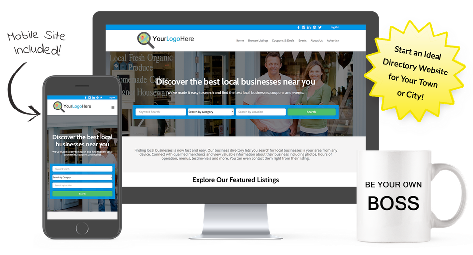
Start a Directory Website for Your Town or City with Ideal Directories!
Make money promoting local businesses, coupons & events in your area.